Built Shelter's design system, cutting development time by 75% with reusable components.
Project Goals: Develop a centralized design system to maintain consistent branding.
My role: Led design system architecture and component design.
Collaborated with: Development teams, UX teams, marketing teams, project managers.
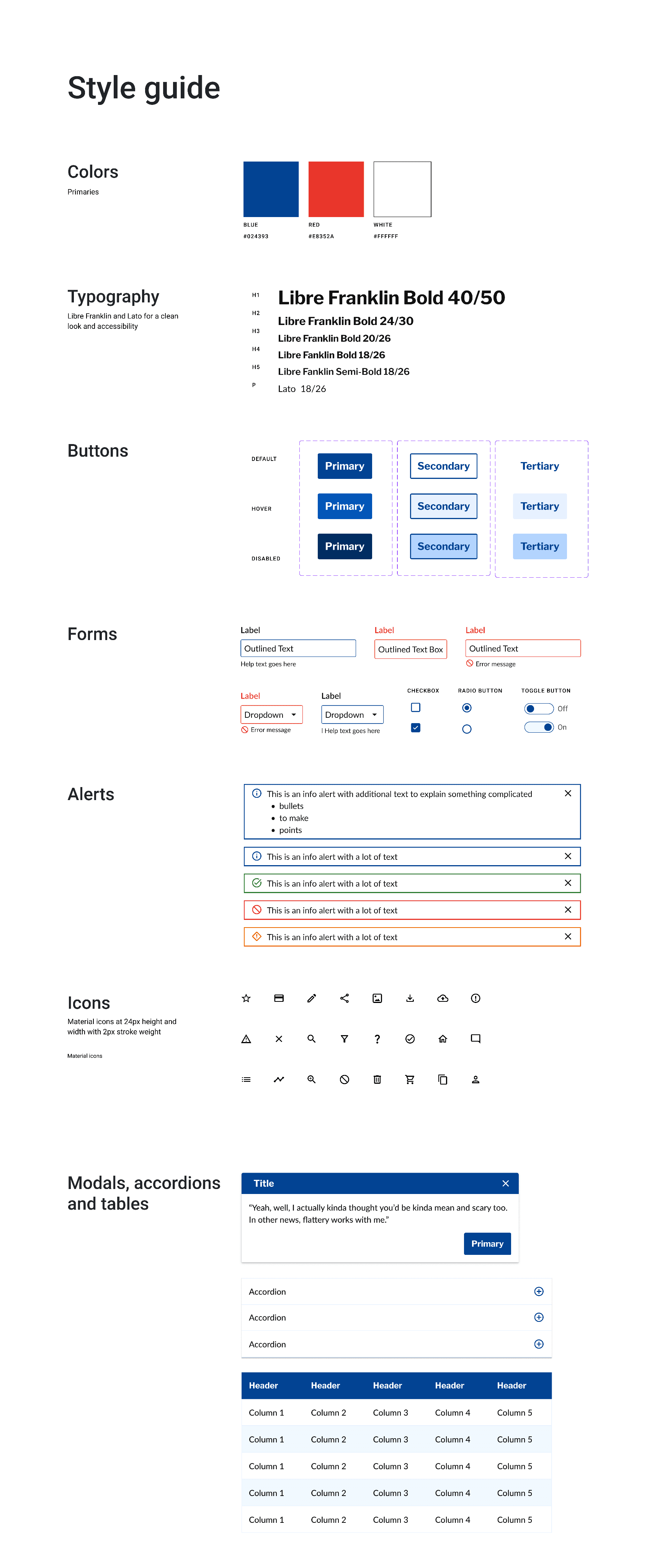
Deliverables: Refreshed Shelter Insurance’s design system based on Material’s design system, collaborating with developers to create design system resources for React, Angular, and web components.

After auditing Shelter’s sites, both internal and external, we realized our branding was inconsistent across brands creating uncertainty for our customers.
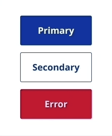
Inconsistent branding: I found over 5 different blues for our primary color, with over 10 different types of headers and fonts.
Concerns:
• Customer confusion: Users moving between pages encountered
inconsistent designs that didn't feel like the same company.
• Development inefficiency: Developers spent many hours writing
code to recreate similar components repeatedly.
•Design waste: Long design time was required to recreate
everything from scratch for each project.
Methodology and stakeholder management: I ran regular stakeholder meetings throughout the design system development process. Simultaneously, we built an internal application that served as both a testing ground and proof of concept - allowing us to validate components in real-world scenarios and iterate based on actual usage.
Analyzed industry-leading design systems to inform strategic decisions and start building.
Competitive Research & Analysis: I analyzed design systems from IBM, Material, Clarity, Dell, and Adobe to identify essential components for Shelter's internal tools and customer portals. This research informed strategic decisions about which patterns would best serve our diverse user base.
Material-Based System Architecture: I built Shelter's first comprehensive design system using Material Design as the foundation, working directly with developers to create resources for React, Angular, and web components. This established consistent UI patterns across all digital touch points.
Brand Modernization & Accessibility: I collaborated with UX designers to refresh Shelter's visual identity and style guide for digital applications. Designed accessible components in Figma that brought the insurance brand into the modern digital landscape.
Cross-Platform Implementation: Delivered a scalable design system that unified previously inconsistent interfaces across websites and applications. This foundation enabled faster development cycles and consistent user experiences across all Shelter's digital products.

Real world testing through an internal application
Testing: I tested our components in real time with developers. This provided insight to bugs or issues that I could either redesign or have the developers update the code.
While testing, it became clear that web components worked easily for the developers since they worked across several different frameworks.
Cut code time by more than half:
Devs went from coding thousands of line of code for one component to 65 lines of code.
Cut design time by hours: UX designers didn’t have to build components from scratch in Figma, cutting design time by a few hours.
Ensured consistency through collaboration: UX designers and devs were able to collaborate and make consistent designs.
Pamela Sextro-Kelly
Contact
